

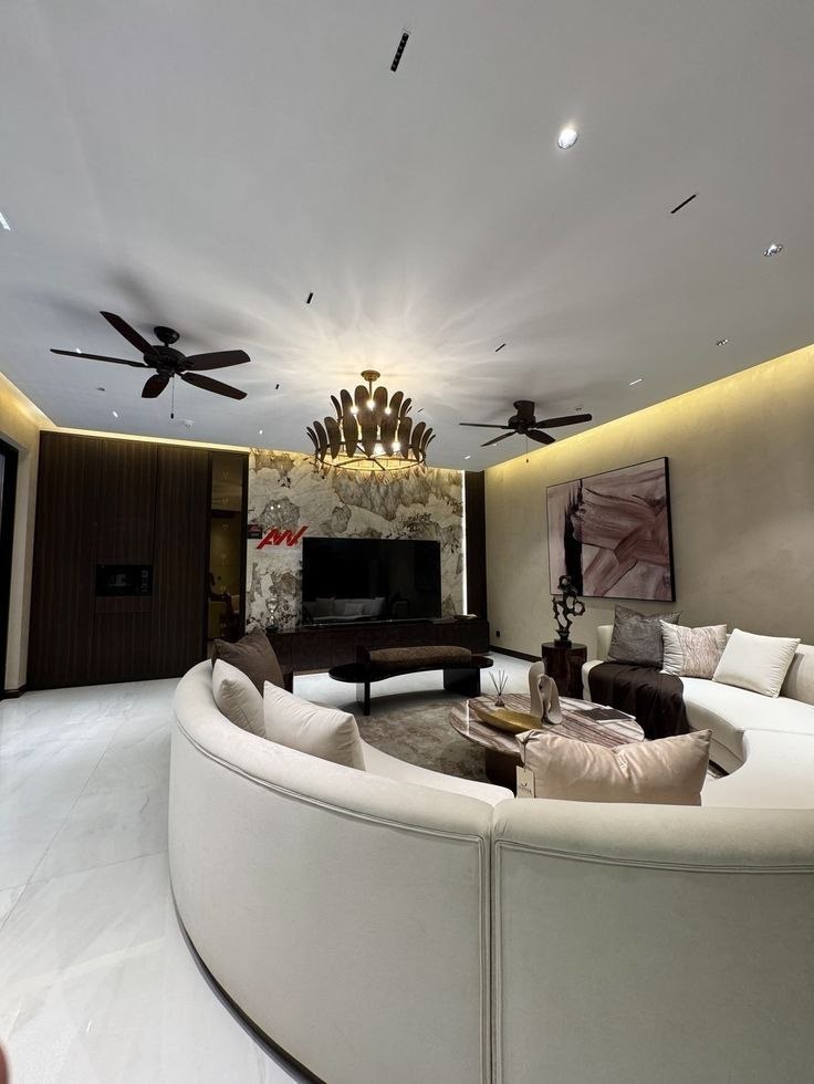
The Timeless Proportional Rule of Interior Color
One of the most frequent dilemmas on Reddit’s r/DesignMyRoom is: 'My room feels either completely sterile and grey, or chaotic and mismatched.' The solution used by interior architects worldwide is the 60-30-10 principle.
How the Formula Works:
- 60% Dominant Base: Sets the room's overarching canvas. This covers primary wall paint, large area rugs, and primary architectural tile/flooring. Typically a calming neutral (warm taupe, soft cream, greige, or soft stone).
- 30% Secondary Color: Supports the base tone with character and contrast. This applies to large upholstery (sofas, accent walls, heavy curtains, and large wooden cabinetry). Think charcoal grey, warm walnut, soft olive green, or navy blue.
- 10% Accent Color: The visual exclamation point. This is used in throw pillows, artwork, ceramic vases, metallic hardware (brushed brass or matte black), and statement poufs. Think burnt terracotta, emerald green, mustard, or brass gold.
Real-World Palette Example: The Modern Kolkata Living Room
- 60%: Warm ivory walls and beige travertine porcelain flooring.
- 30%: Fluted walnut TV paneling and charcoal linen sectional sofa.
- 10%: Burnt amber velvet cushions, brushed brass light pendants, and emerald potted greenery.
Pro Tip: When testing paint swatches, paint a 2x2 ft patch on opposite walls and view it at 9:00 AM, 2:00 PM, and 8:00 PM under warm artificial light before committing.